
I’ve always believed in the importance of empowering our clients with a greater understanding of their finances so they can make better business decisions. This doesn’t mean just emailing off an automatically generated report at the end of each quarter and hope it all makes sense. Because everyone is different, it means customising our approach with each client to make sure they all can understand and interpret what the numbers really mean. Let’s face it, financial data has a reputation for being boring, clients are time- poor and some find reports difficult to understand. Depending on one’s level of financial literacy, statements such as the Profit and Loss and Balance Sheet are not always easy to read and fully comprehend at a glance. Long lists of numbers are hard to visualise, interpret, and then apply critical thinking to. They are difficult, if not impossible, to use to determine trends, issues, and to highlight potential problems. For this reason I have always been a firm believer that financial information means more if it’s presented in the easiest way to understand.
Most people are visually inclined, so pictures and graphs can go a lot further in providing understanding of a message than just text and figures alone. Numbers are abstract and also relative. The value depends on another number being used as a comparison and in this way they’re different from images and words. If you are presented with an image or word, your mind will create an association with this. A number is not as easy to imagine. When I present numbers to clients I want them to understand what’s behind those number. For example, if I told a client that the sale of one of their products had increased 20% over the last year this may not sound like much but if I then go on to explain that this number represents a total greater than the three previous years combined, then it’s a very good result. This number then becomes meaningful.
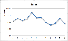
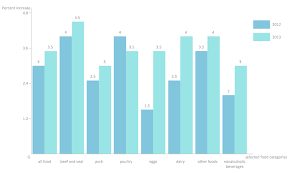
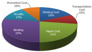
Depending on how much detail clients require with financial statements, I find it’s important to make the numbers concise and use highlighting to show them what’s really important. It’s often unnecessary to go through every figure from every report. Probably the best way to show financial information is graphically. The most common forms are line charts which are good for showing trends over time, bar charts that are best for showing comparisons and pie charts which are useful for showing relative comparisons, such as percentages or size comparisons.
There are a few rules I always make sure I follow with graphs. The most important is to state clearly and concisely the point of the graph, and to draw attention to the most important information. I also like to help explain every graph with words placed close to it, and if possible, on the graph. Using colours to show different elements of financial information I find is also a good way to show or highlight comparative information. But too many colours can be just as confusing as not using any, and I always add a legend where it’s appropriate. Whether the need is to inform or to persuade, graphs are an efficient way to communicate because they can illustrate trends not obvious in a table or list of numbers, make conclusions more striking and create maximum impact. I find graphs are not only useful in the presentation of information but in the analysis of data as well. By giving meaning to numbers and making financial data engaging and easy to understand, I believe I provided my clients with greater certainty and a feeling of confidence around their business finances.